UX Case Study | UI Redesign
Shezlong
This work is about Shezlong - number one in online Arabic psychotherapy worldwide. Redesigning and improving the Shezlong app for better UI and UX.
Agency
Role
Date
Oct, 2023
Design lead, Usability Studies, Design direction & strategy
Ulmost
Competitor Analysis, Market Trend, UX audit, Art direction, UX/UI Design.
Sector
Mental Health Support

Emotions.
Feelings.
Moods
In the symphony of daily existence, emotions, feelings, and mood compose the harmonies that shape our every step, influencing the cadence of our lives and coloring the canvas of our shared human experience.
01.
About shezlong
You Talk... We Help!
This is a catchphrase that almost every User on Shezlong is familiar with thanks to the Mobile app that can allow users to talk to their therapist online privately anytime anywhere!
Shezlong is the first online psychotherapy platform in Egypt and the MENA region. It brings online psychological therapy to anyone who struggles with the daily battle of their own mind. Shezlong provides easily accessible, affordable and anonymous online therapy with licensed professionals. The platform currently has over 200 professionals listed on the platform who come from more than 20 different countries and speak 7 different languages.
Project Goals & Requirements:
Redesign
the Shezlong app.
Exploring new design frontiers for Shezlong, an already existing brand was quite interesting since I took a curious approach to it. I started my exploration by defining a full plan of action. The idea was to design a UI/UX concept and experience for Shezlong's existing mobile platform. At the moment, the mobile app is used by over 800,000 people across Egypt—and quite possibly a lot more people across Arabic-speaking countries.
Acknowledging the quality of the UI of the current mobile app right from the start adds authenticity to my exploration — this redesign was done with a plan to make the Shezlong mobile app more user-intuitive, an initiative of Ulmost Design Agency.
Market Competitors
In a landscape crowded with therapy app competitors, Shezlong distinguishes itself by fostering a diverse network of qualified mental health professionals. Shelong competes with well known therapy brands like:


My compass was calibrated to discover, define and empathize. I embarked on a journey of discovery, definition, and empathetic understanding, weaving these elements into the fabric of a user-centric approach.
Define.
02.
User Complaints
I started secondary research looking into the Appstore and Playstore and found clear descriptions of the problems users faced when using the Shezlong App.
"Disappointing, not recommended especially if you are in pain. It is a kind of fake service, don't trust them, i reserved a session with dr. Who cancelled the session immediately, and i reserved another session and put my time and HOPES, yet the dr. didn't attend also and the technicals told me to reschedule with cold heart, they are not professional at all, it end me worse 😓, i have all evidence that prove my say."
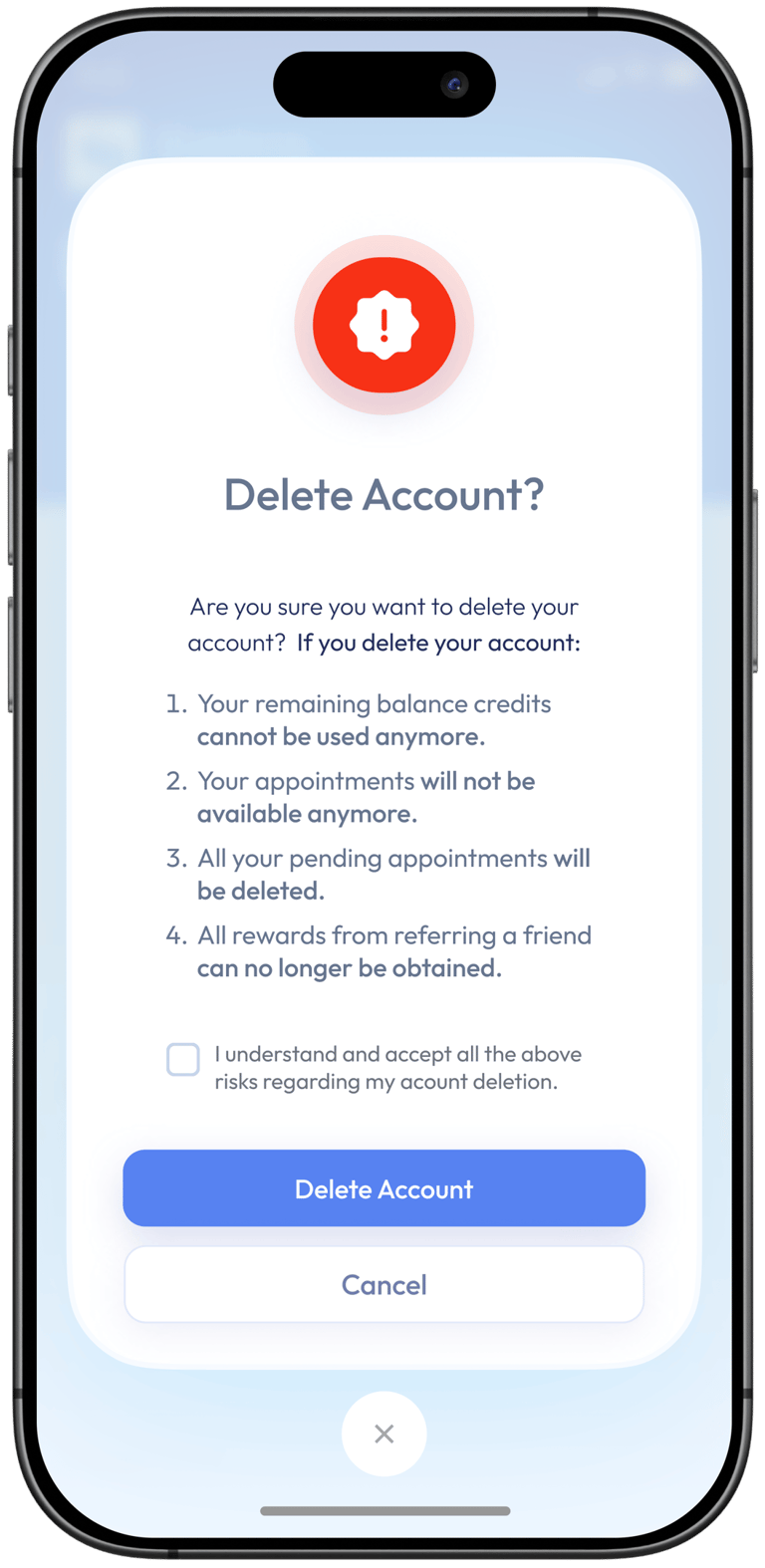
"Very dull. How do I delete my account?" - Merhan Ahmad
"You guys need to add in the filter if the therapist prescribes meds or not" - May Mohammed.
"Horrible app and the most idiotic experience ever"
A mental health app that doesn't care about mental health. Unprofessional team, money-oriented and buggy application
"Unfortunately the app is not ready to have users. Not user friendly and video doesn't work or link to use the app".
Good therapist, horrible customer service
The therapist was good, but the customer service is almost always useless. I was not able to attend my session
"Very bad service"
"Really bad service they are not professional. Can you imagine there is no function for deleting my account hahaha what service is that?"
"Terrible app ! Very bad calling quality during the session , connection has stopped many times while the net connection is good , the app closed so many times during the call , I paid with Vodafone cash and transfer the money for the number I paid for it in the previous time after I transferred the money they said they changed the number and I lost my money they refused to refund me while the old number wallet connected with their company and i paid for it in previous sessions many times"
"Very Disappointing Service/App Experience"
"One of the most frustrating ways to discourage mental health patients is through this app, which causes more problems than it serves. As an Egyptian or Arabian online platform, it should provide affordable mental health services. However, if you make a reservation within Egypt and travel elsewhere, the app will prevent you from attending your session, and getting a refund is unlikely. Imagine scheduling a mental health appointment for a friend overseas, only to have the app deny them access. Support asked for more money, despite the circumstances. The psychologist was absent because my friend could not connect. They insisted on paying in the local currency when abroad. It's as if they exploit people's needs and charge exorbitant rates, unlike how things are done in the UK or USA. On top of that, I lost 600 EGP / $30 because of their negligence. Will never use again!! 👎"
"Stupid customer service and policy .. they have been rescheduling my sessions in short notice and when i had an emergency and needed to reschedule .. they told me no way and our policy and the system cannot reschedule and i had to pay money for this session with no rescheduling option .. if client want reschedule it is not possible but if the doctor decides it works ! 2. Application is very weak the video chatting is not working via the app so the therapist had to send me a Zoom Link!"
"I was unable to access the session due to my travel and the intransigent policy of the app. The session was booked from Egypt two days before the appointment date. I was acces the session from outside Egypt as per my unplanned travel. I didn't allowed to access and technical support team asked for a very high price difference to allow my enter (from 400 pounds, which is equivalent to 13 dollars, to 45 dollars, which is equivalent to 1400 pounds). They even refuse to reschedule it for me."
"I was wishful about this app but it isnt good. It automatically found the wrong time zone for me and made me schedule at a wrong time. I had to contact support and after about 20 minutes of talking they told me the policy doesnt allow me to reschedule (the policy is provided in the booking page but isnt clear at all about rescheduling). Save yourself a buggy interface and incompetent customer support and dont use this."
What I Explored
I found clear descriptions of the problem users faced when using the Shezlong App.
I wanted to explore the possibilities of a modern UI interface. I envisioned a new design of the Shezlong app that would allow the users to enjoy the best of the app experience, where the therapy digital experience is intertwined with physical ones.
I sought to simplify the experience of looking for a therapist, finding a therapist, booking appointment with a therapist and having a therapy session in the app, while giving the users the power to control what they do on the app without feeling as though they paid huge dollar for a wasted time.


User Flow and Navigation
Performance and Reliability
Clear Communication and Policies
Visual Design and Branding
Going to the source of the problem for several users, I identified four highlighted areas of pain point because most users reported difficulties in navigating the app, encountering loading issues, and facing challenges in scheduling appointments. My focus was to redesign the user flow to be more intuitive, streamline the navigation, and ensure that critical features, such as appointment scheduling, are easily accessible. Minimize the steps required to perform essential tasks and enhance the visual appeal of the app with a modern and user-friendly design.
Shezlong offers a platform that connects users with licensed therapists through video calls. Individuals can connect with a wide range of psychiatrists and psychologists. These professionals are available to provide therapeutic services in multiple languages.
User Research
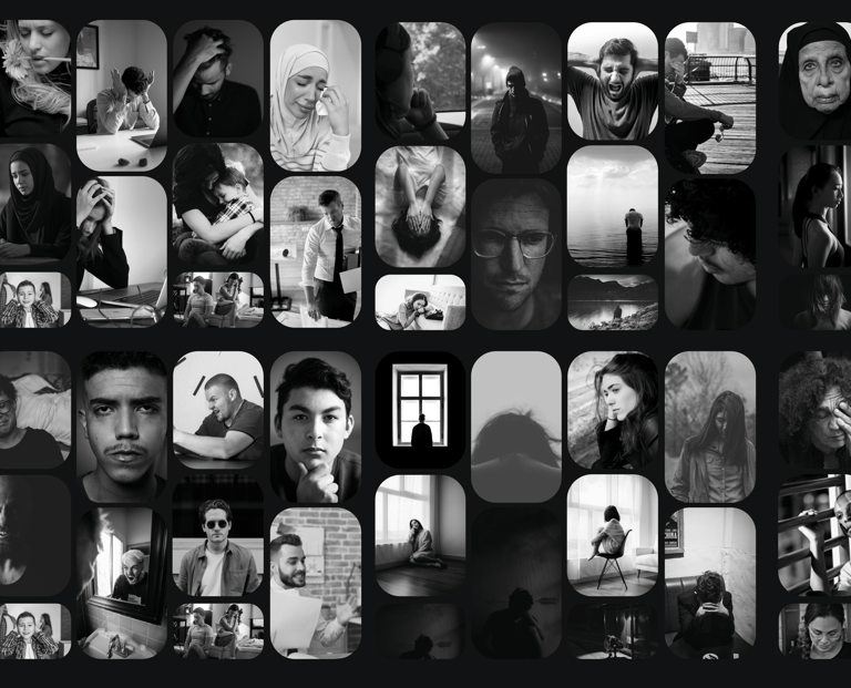
I ran an online survey and interviews. This was done to understand the users individual pain points, to know if the app was helping its these users who are in need of therapy to achieve their individual goals with the app. This was also to give us an understanding of how we can develop the brand and improve on the already existing app. I decided to have a diversified audience from various backgrounds of life in Egypt. The participants were 50 in general (23 Men and 27 women) ranged from the ages 22 years old - 45 years old. Upon completion of the interviews, we were able to discover the individual pain points of the users.
ResearchSummary
I asked users questions on the challlenges they faced while using the Shezlong mobile app for therapy, and we designed a digital questionaire and shared it with potential users to share in their plight and user behaviour.
80%
20%
Responses highlighted dissatisfaction with the app. Specific issues include billing and payment, currency exchange fees, unexpected charges, and challenges with payment methods.
Some expressed positive experiences, This theme suggests a varied user perception of the quality of therapy provided on the platform.
Mixed Sentiment
Negative Sentiment
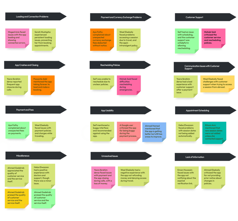
Affinity Mapping
To conclude the discover and define phase, I went over every bit of data I gathered and I made an analysis and found some important answers/feedbacks we got from some of the users.
Insights
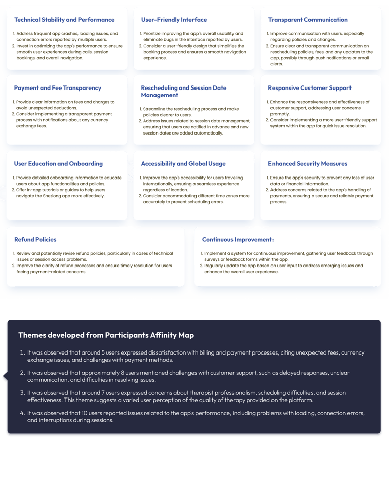
We made themes from all participants affinity mapping including insights from reviews and complaints both on Appstore and Playstore and found the following highlights:
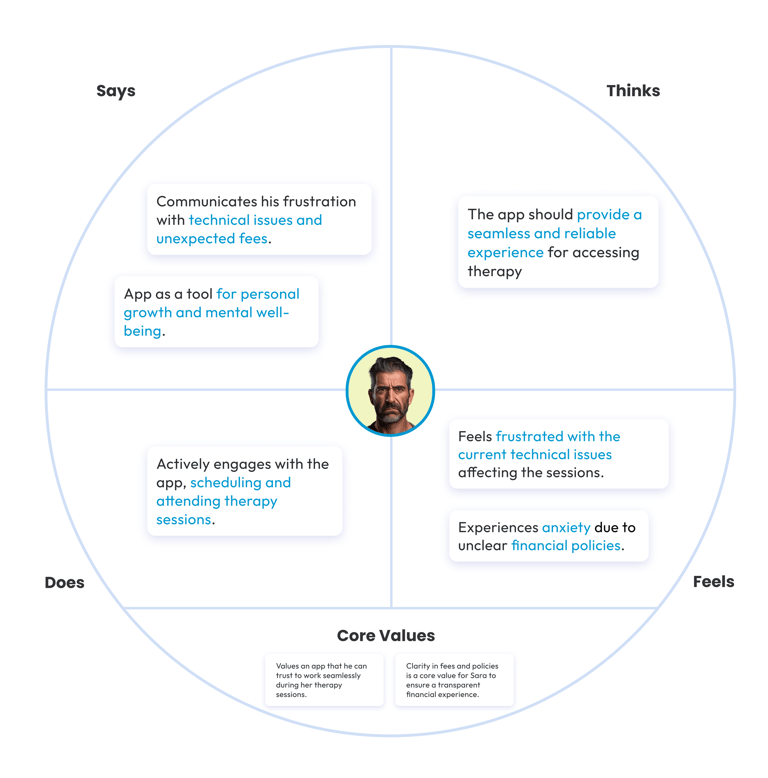
User Personas
By combining quantitative data with qualitative insights, we crafted personas that represent the varied experiences and expectations of Shezlong’s user base.
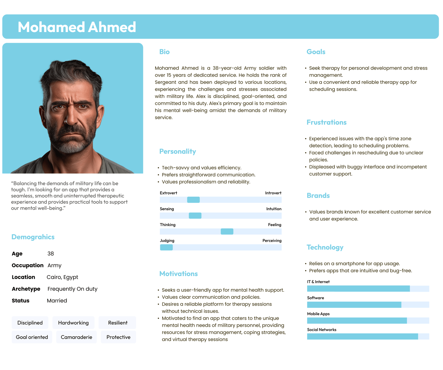
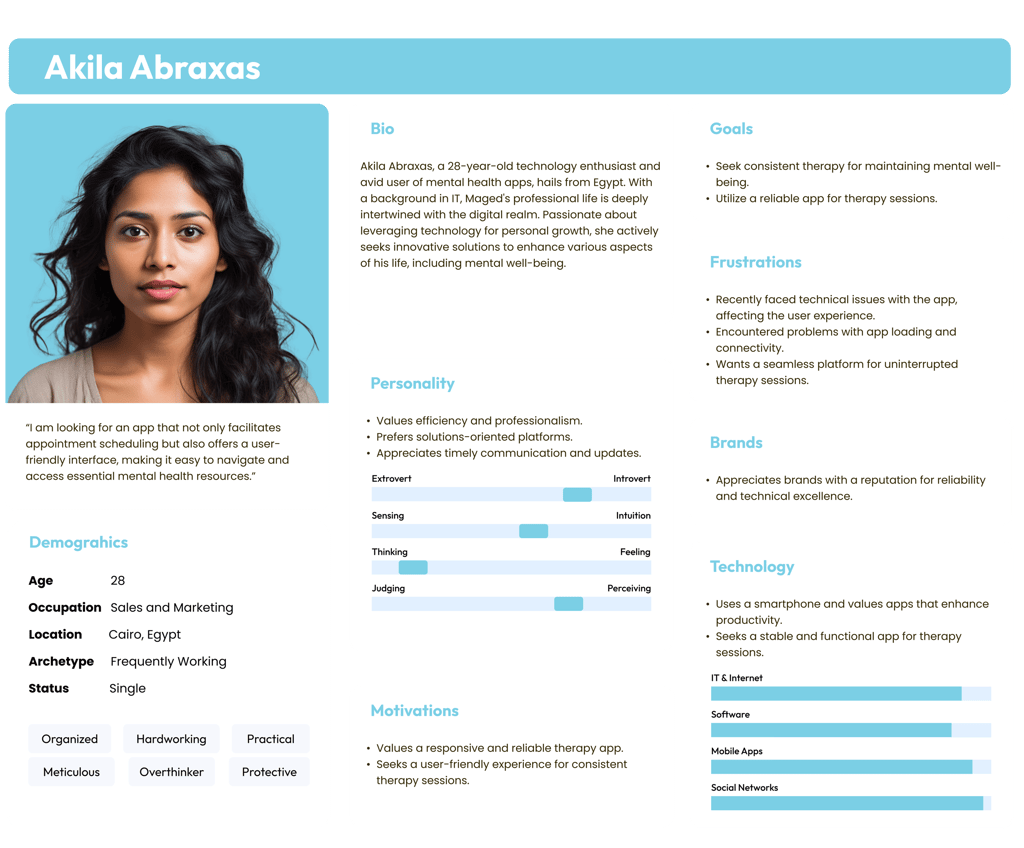
We embark on the path of innovation, guided by the core principles of ideation, exploration, and prototyping to shape a transformative user experience.
Ideate. Explore. Prototype.
02.
How Might We's
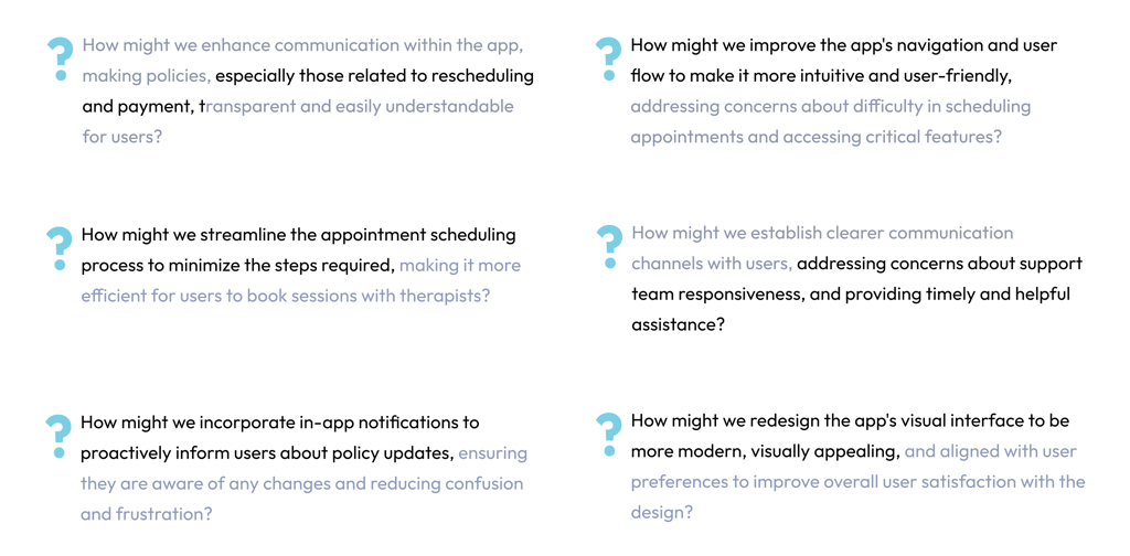
Now we found problems to solve, we might want to know how we might solve those problems and for that we ask questions;
The Solution
To design a more efficient UI that brings a seamless user experience and reduces frustration to the user.
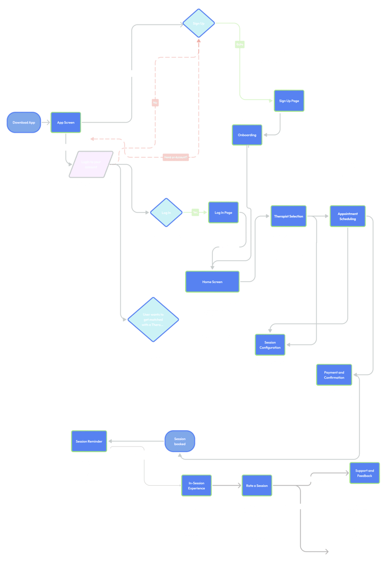
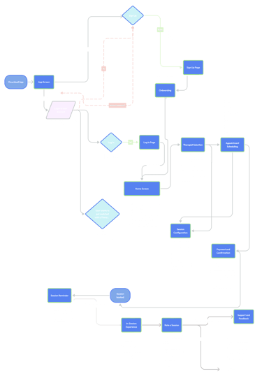
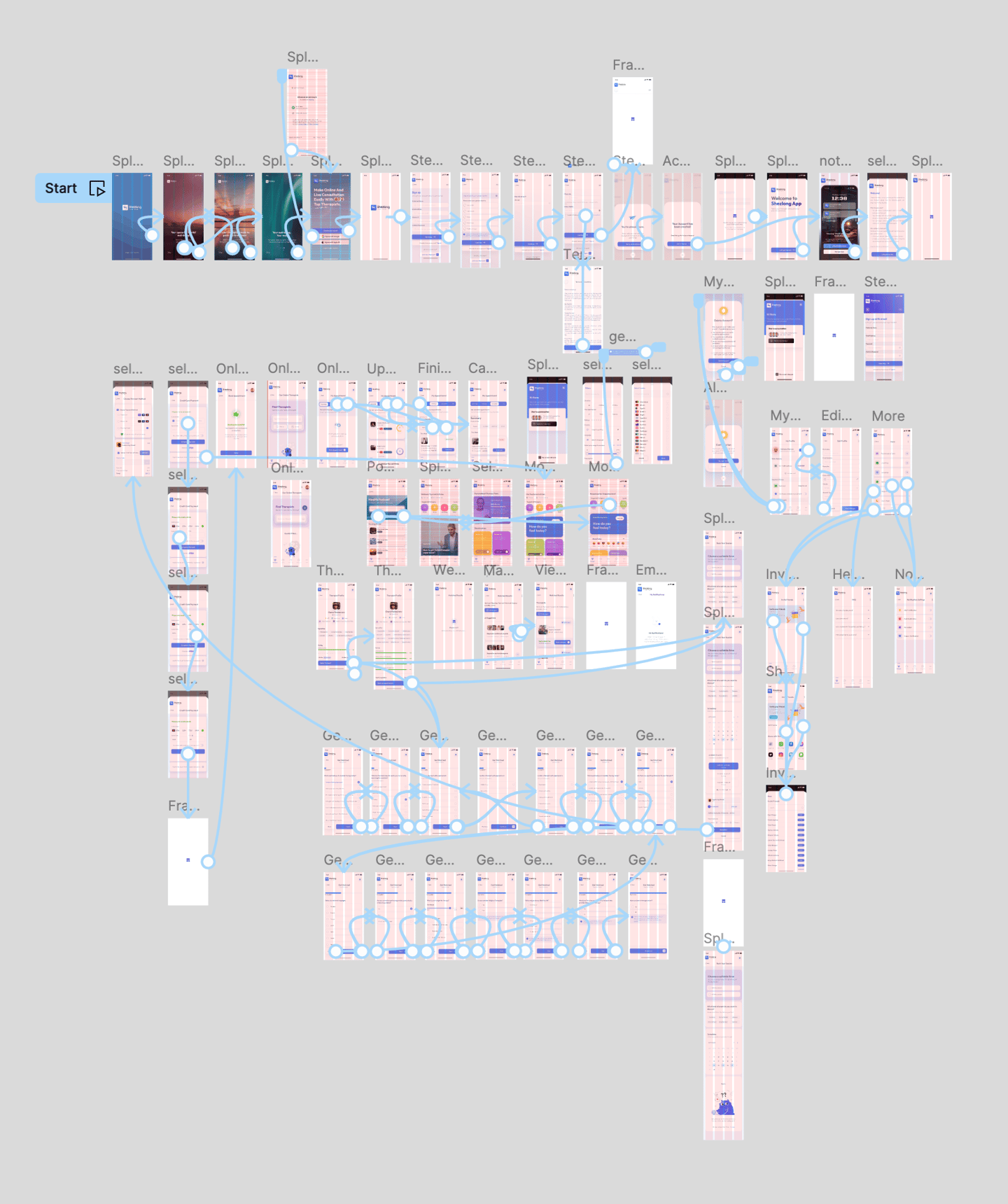
The Customer Journey Map / User Flow
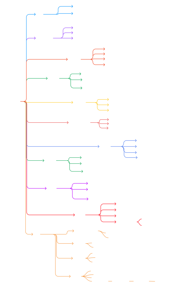

App Architecture
Now we found problems to solve, we might want to know how we might solve those problems and for that we ask questions;
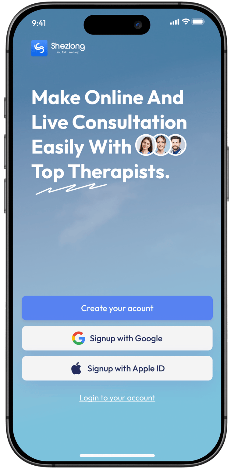
UI Before Redesign
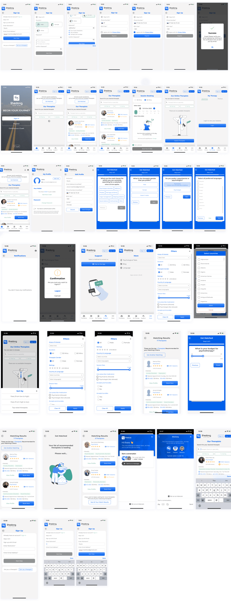
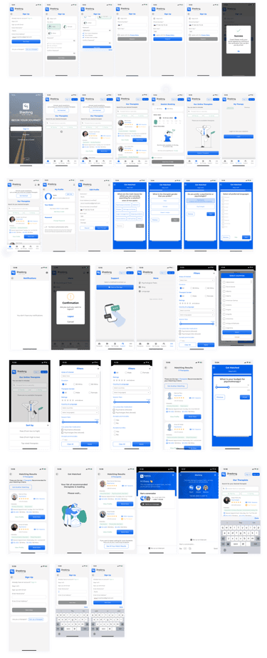
Embarking on the redesign project for the Shezlong app involved a comprehensive walkthrough of the existing platform. This process allowed me to gain valuable insights, identify pain points, and understand user interactions, ultimately informing our strategy for a transformative redesign.
Planning
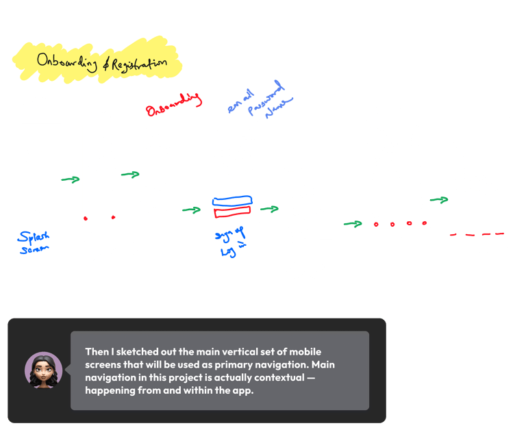
I started the exploration of design concepts by defining a full plan of action. I jumped into figma to sketch. I start with a sketch from the responses from the participants using a simple grid.
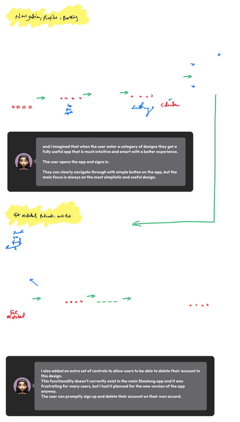
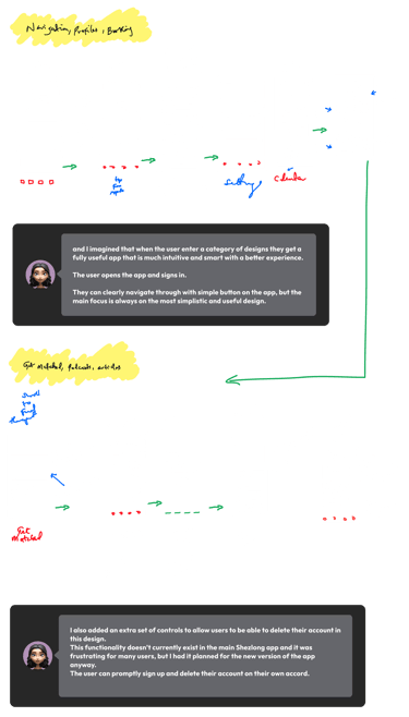
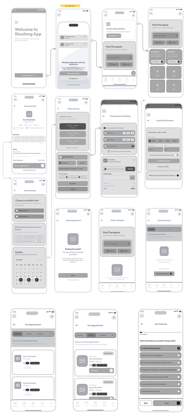
Mid Fidelity Sketch
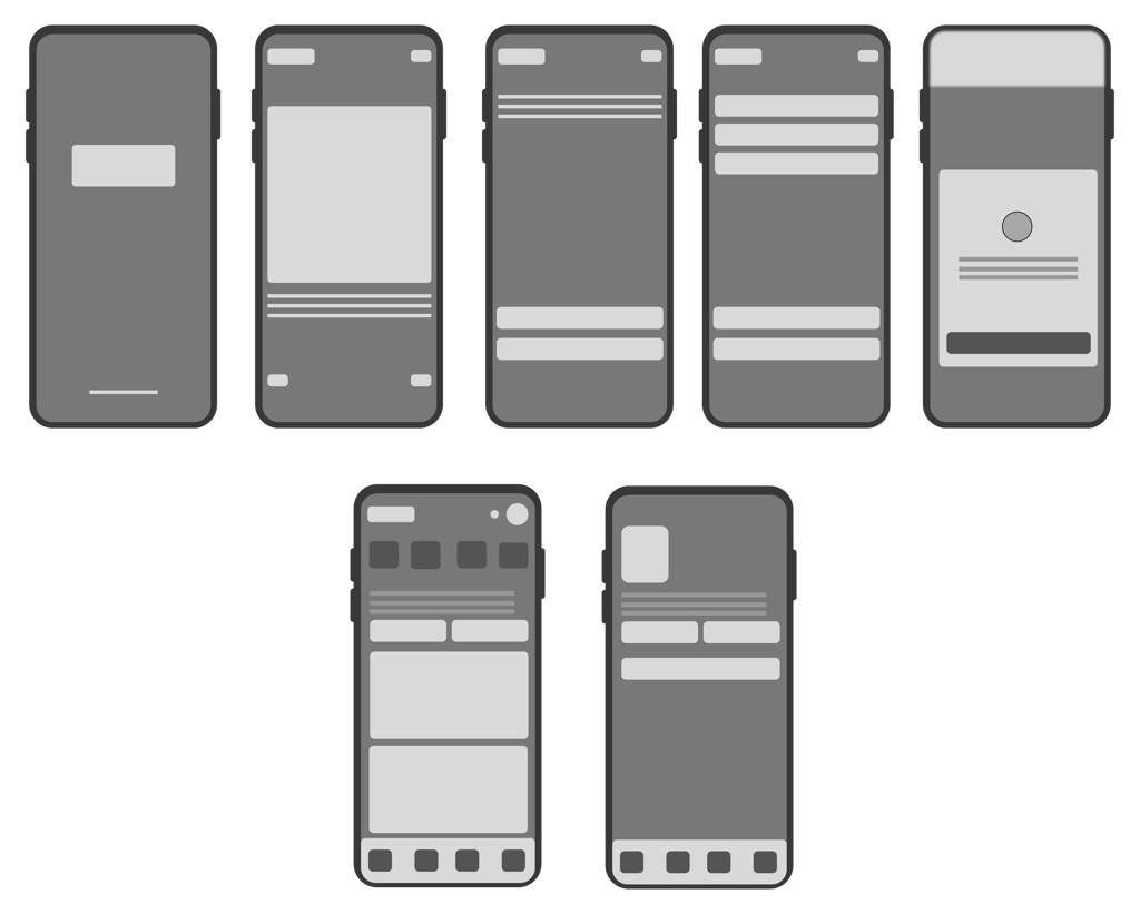
Knowing the plan I went ahead and sketched the main screens in mid-fidelity to see how they all come together.
The main screen was fairly simple. A grid of designs, home screens, user profile, and ability to navigate around screens.
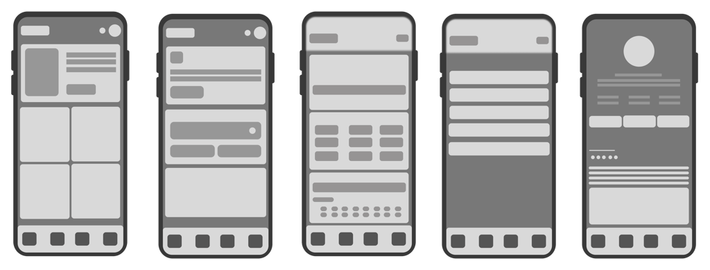
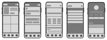
The sketching and wireframing experience turned out quite nicely with cards. Sketching and wireframing with cards was an effective and flexible approach in our design process. It allowed for a tangible and visual representation of different elements, making it easier to iterate and communicate ideas.
That led to a pretty interesting user interface. It did have some clarity problems for the selected icons, however.
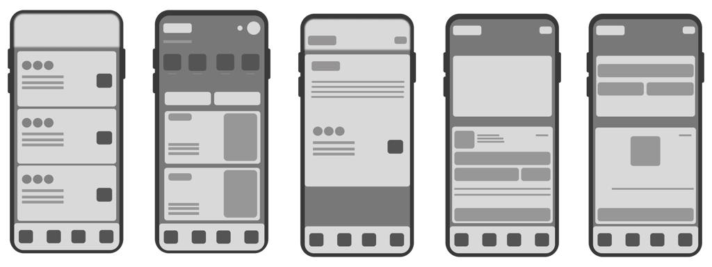
The next step was to explore some materials and UI kits. We wanted to try something more smooth and friendly when looked at.
Low Fidelity Sketch
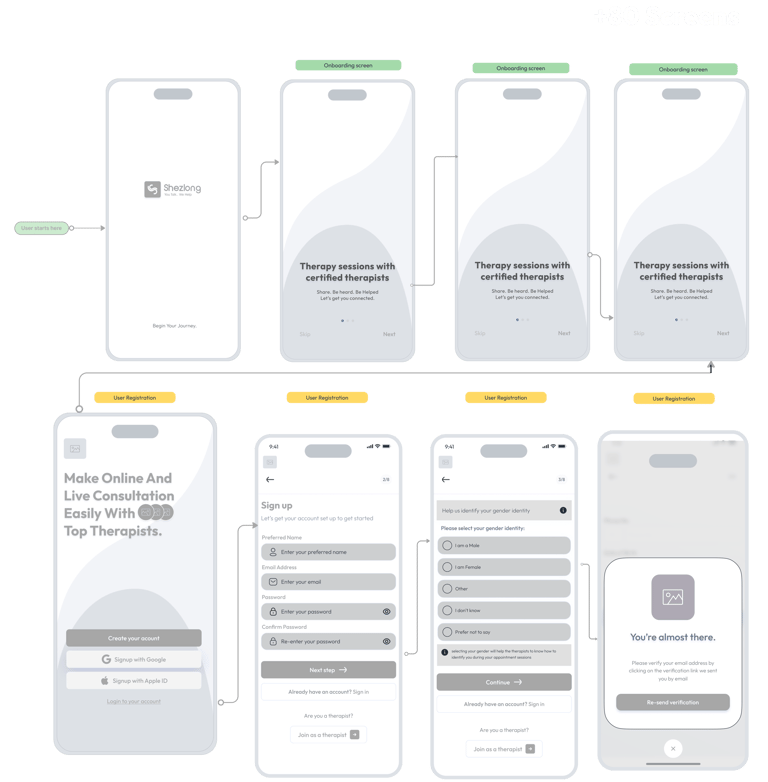
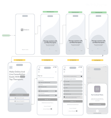
Knowing the plan I went ahead and sketched the main screens in mid-fidelity to see how they all come together.

Creating a High Fidelity Visualization
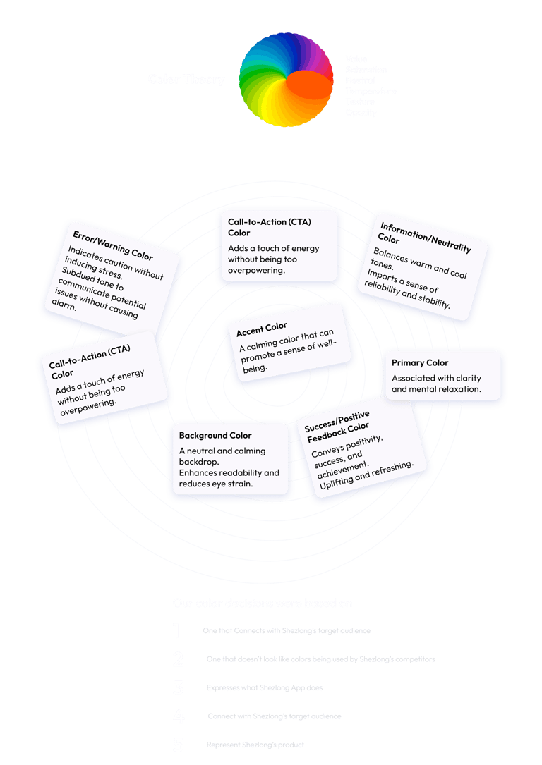
Color plays a significant role in influencing emotions and user experience. For a mental health app like Shezlong, we knew it was crucial to choose colors that evoke feelings of calmness, trust, and positivity.
And yes, for our explorations of this redesign, I reverted to a more colorful, vibrant, and modern looking UI to be sure these new UI materials work well in that scenario.
Mood Board
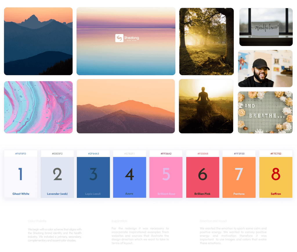

I wanted to collect visual elements that represent the desired look and feel for the Shezlong app redesign
Design Tokens
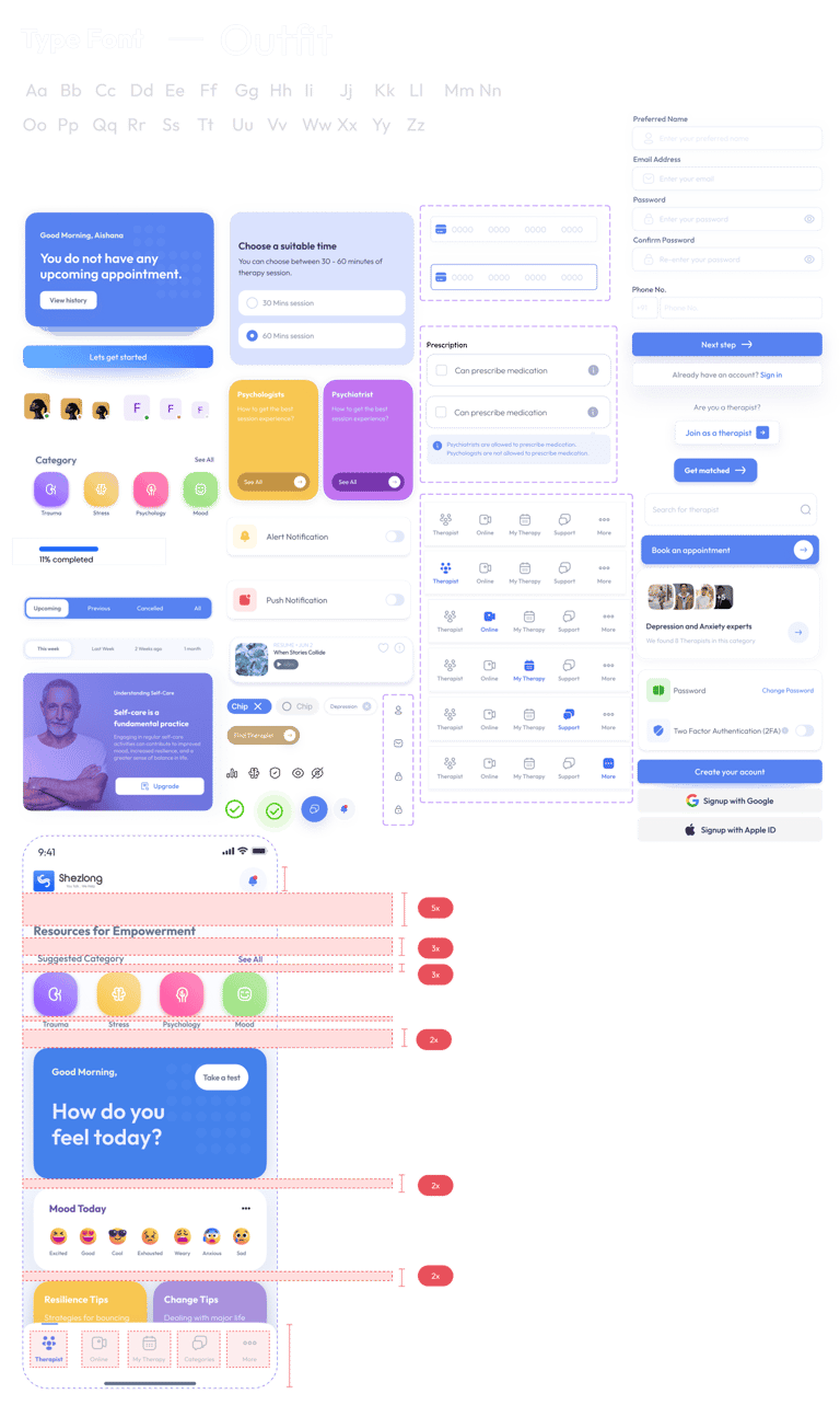
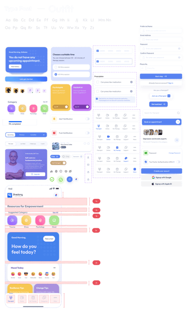
We wanted to collect visual elements that represent the desired look and feel for the Shezlong app redesign:
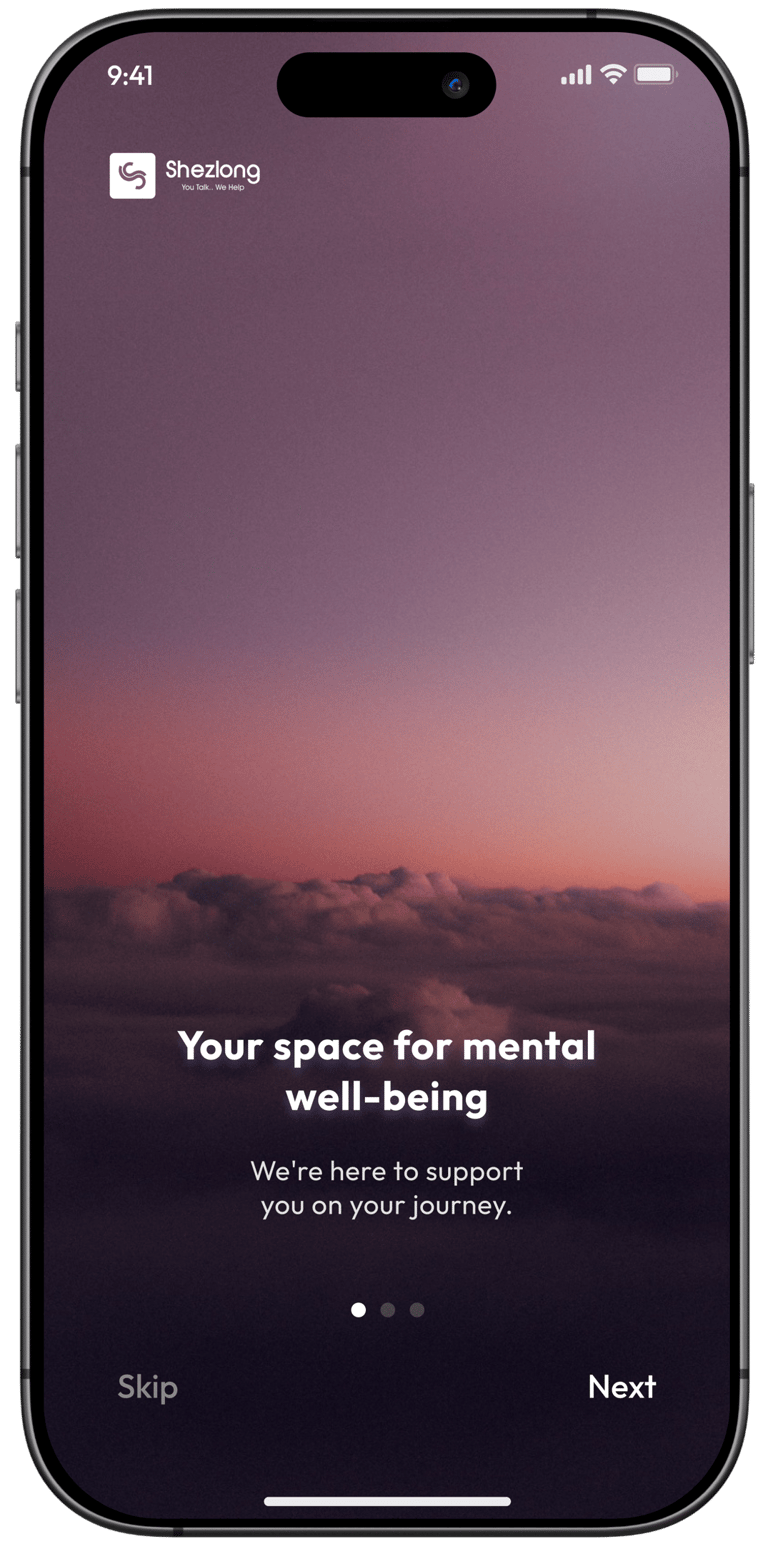
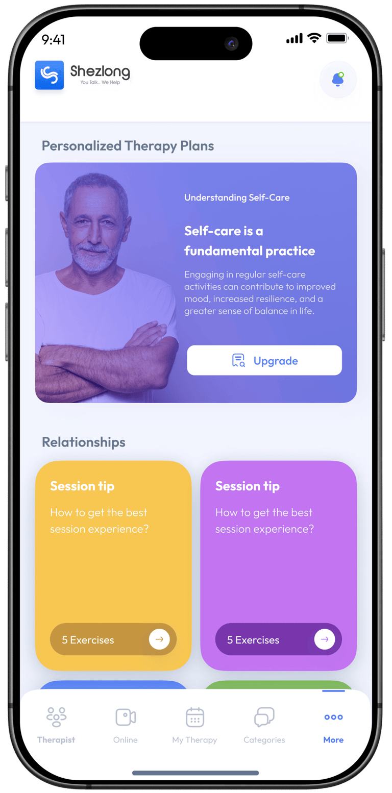
High Fidelity
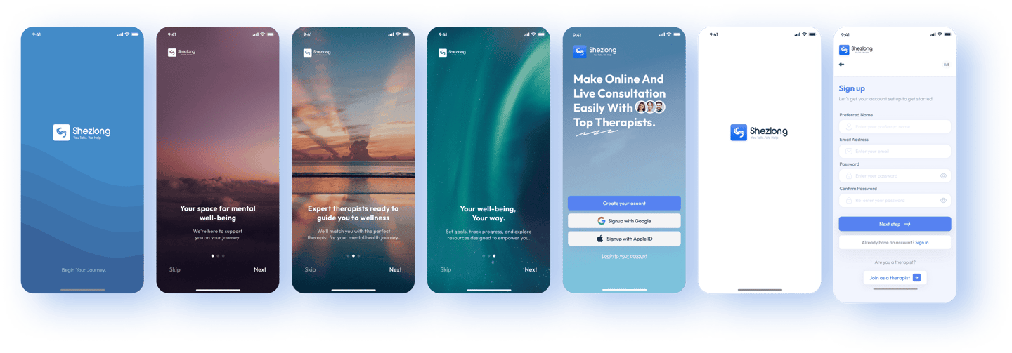
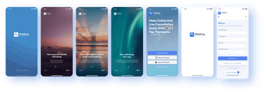
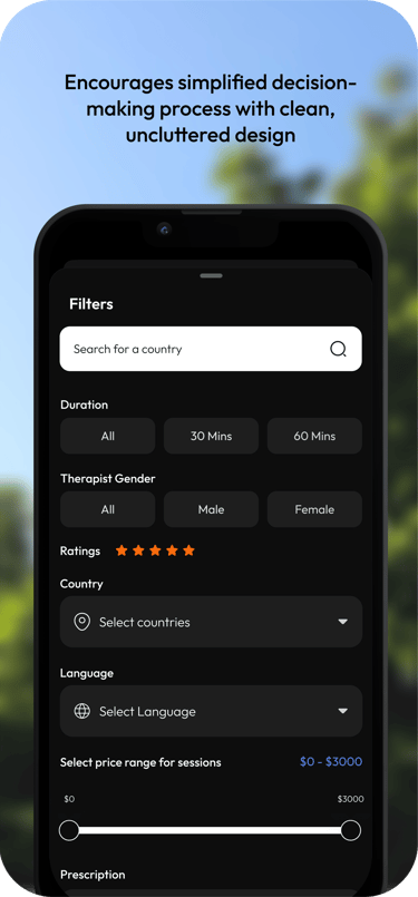
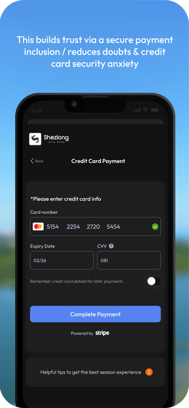
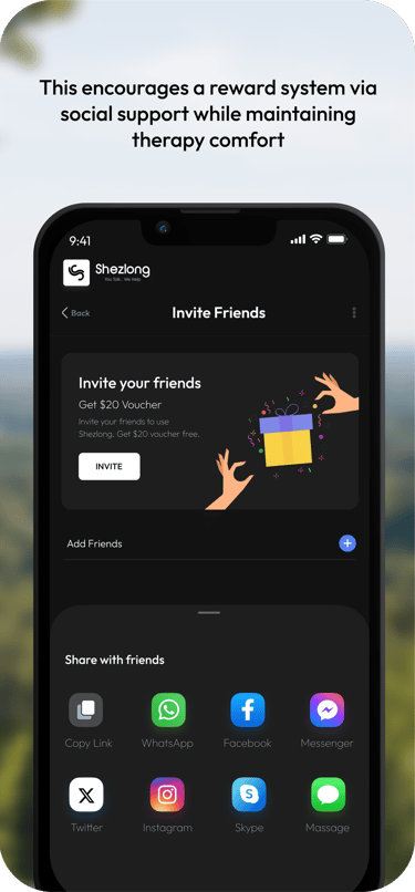
We aimed to provide the app with a new look that fosters understanding and accessibility. Through thoughtful product design, we aspired to ensure everyone seeking mental health support can easily navigate, connect, and enjoy their money’s worth.
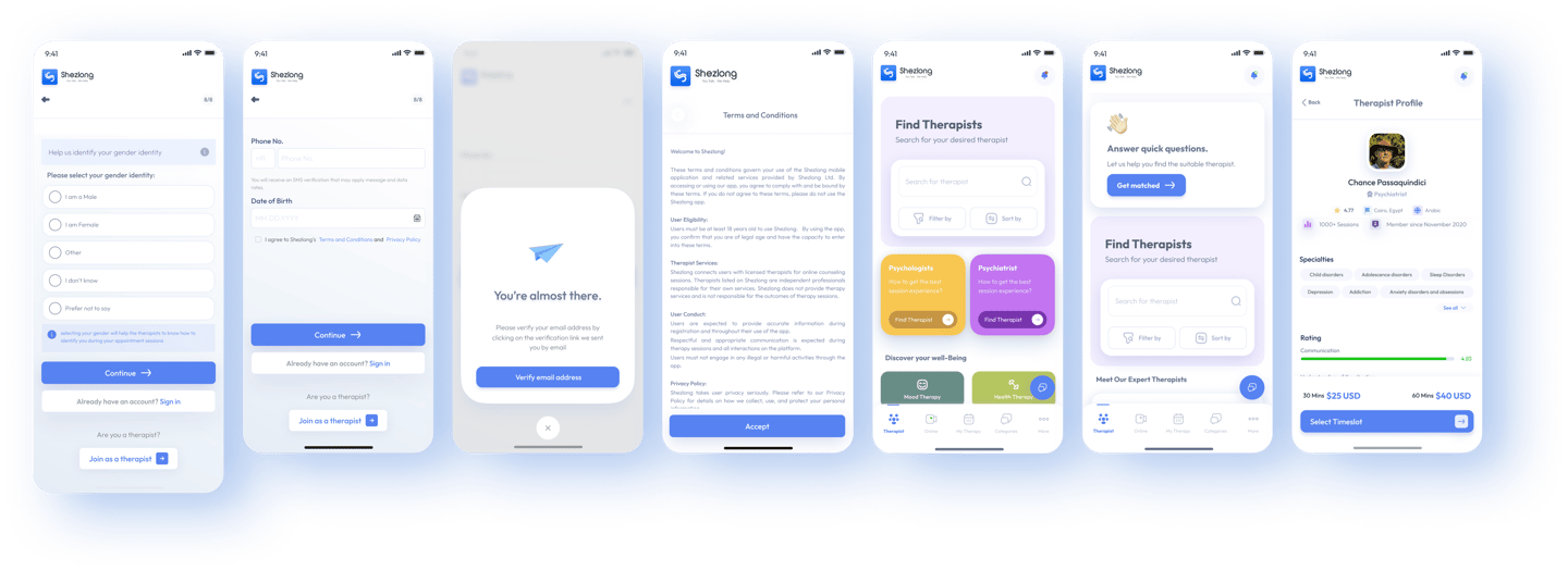
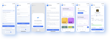

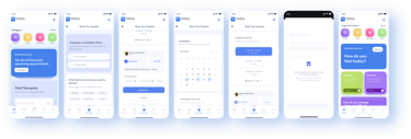
+80 Screens
Color Psychology
Soft, calming color palette
Increased color contrast for readability
Implemented color-coded emotional states and progress tracking


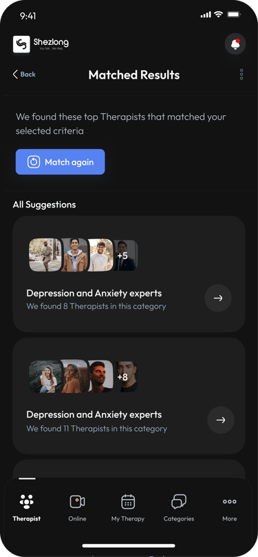
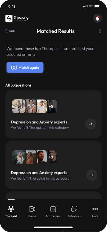
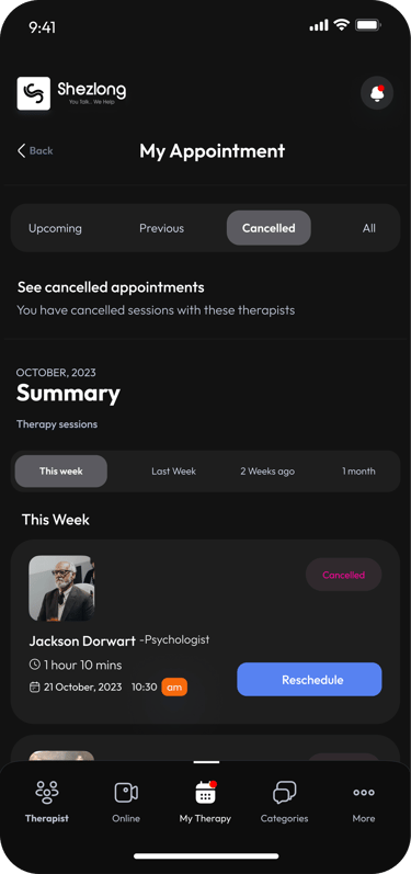

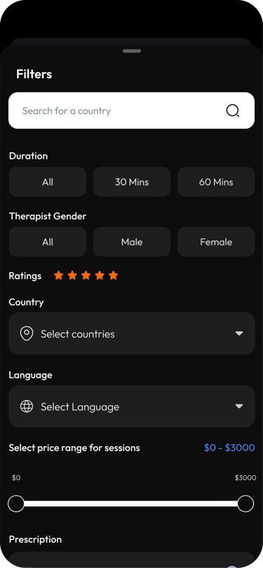
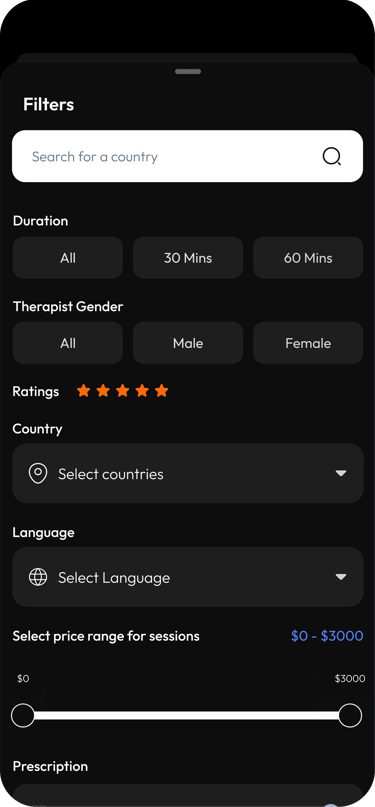
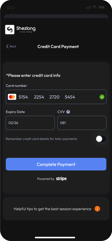


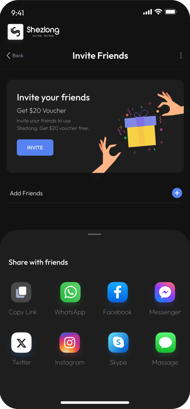

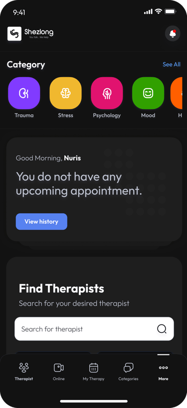
Dark Mode
The rationale behind dark screen mode was to provide visual comfort and reduced eye strain, offer flexibility in user interface preferences and address accessibility needs for users with light sensitivity.
Technological and Psychological Considerations:
To Reduced Eye Strain: Using deep neutral and soft grays implemented a carefully calibrated dark color scheme.
For Energy Conservation: It is optimized for OLED and AMOLED screens
For Emotional Sensitivity: It created a soothing visual environment that acknowledges the mental health context.
For Accessibility: To improve readability for users with light sensitivity or migraine triggers.
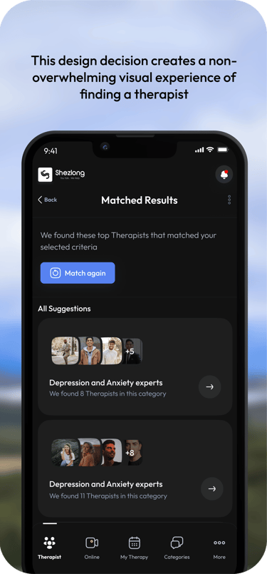


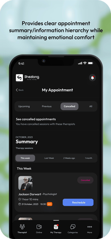

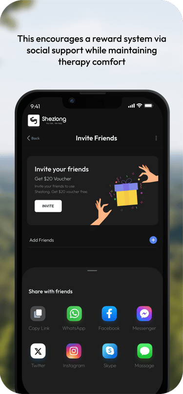
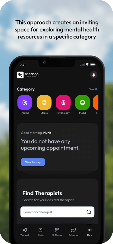

Prototype


User Testing Results
Perceptions about the new designs gathered a positive satisfaction in comparison to the old design with an average of 8.7/10. Navigation efficiency and time to key task completion reduced to an average of 1.8 munites. Dark mode user preference had a 78% percent satisfaction rate, with 65% of eye fatigue reduction and a 42% report on the increase in the comfort of feelings and emotional states while engaging with the new design.

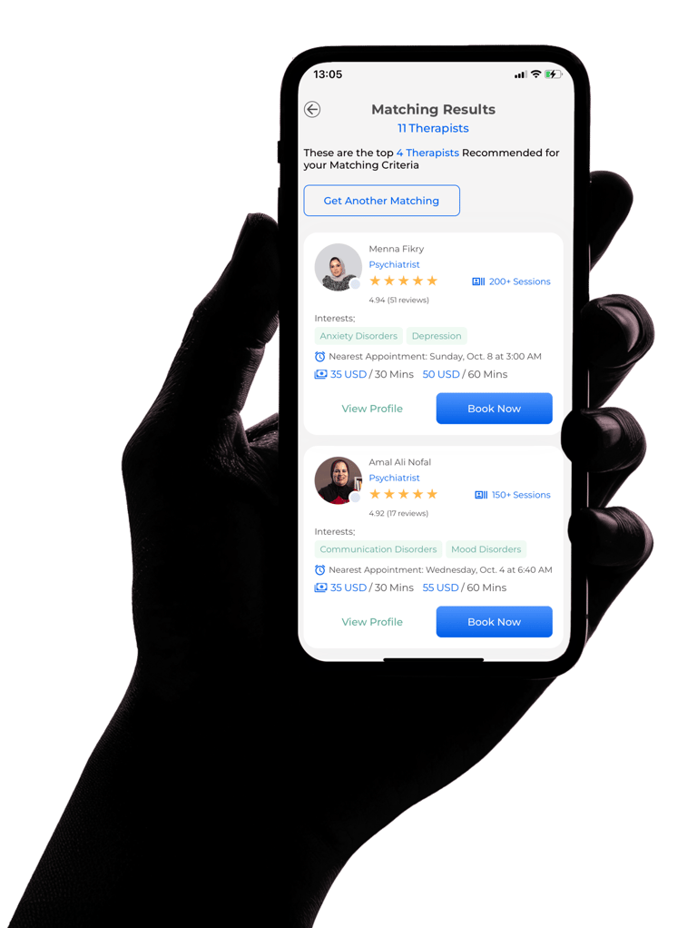

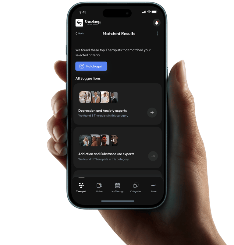
Before
After
Thanks for Visiting!
Your presence here is like a rare constellation of brilliance - unexpected, and transformative. In a digital universe filled with countless paths, you chose this moment, this space, and that alone makes you extraordinary. Your curiosity isn't just a trait; it's a radiant spark that illuminates possibilities others might never see. Thank you - you're not just a visitor to my webpage, you're the unexpected magic that turns an ordinary webpage into an extraordinary moment of connection. If you have some suggestions, please feel free to write to me. I appreciate feedback. It was nice having you visit today!
ANULIKA NWANKWO
Product Designer + IT Product Manager
hello@anulikajoy.com
MEDIUM /
📍North Holland, The Netherlands.

