

How might we reimagine preserving memories with loved ones?
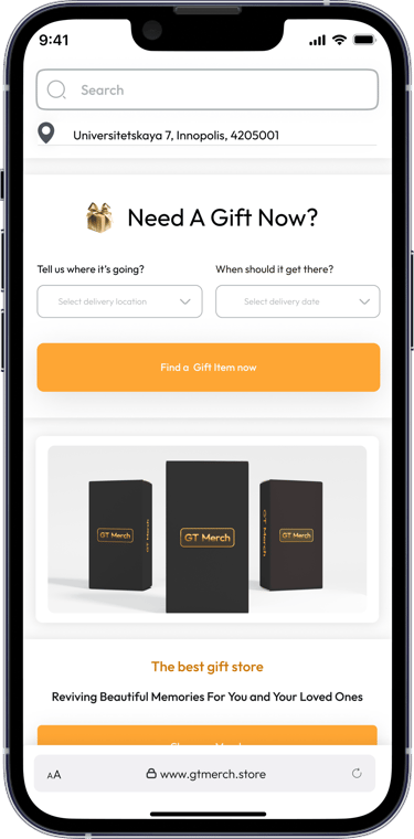
Providing everyday people with a user friendly and modern solution for preserving and displaying digital memories using augmented reality technology, GT Merch brings photos and videos to life in a way that traditional frames cannot. This makes it easier to enjoy and appreciate memories, as well as share them with others. I designed the intuitive web interface that helps customers to discover, understand and purchase the products on the website.
The approach I took was a user-centered design approach in designing a responsive website, with a deep understanding of the user's needs, preferences and behaviours, I used this understanding to guide the design decisions that were made, soliciting feedbacks and incorporating insights from feedbacks into the design.


My decision concerning the Primary Color was because GT Merch’s brand color is composed of Bronze and Black color variants. Therefore I decided to use this brand color to generate less dorminat colors. Doing this is in line with Jacob Nielson’s principles. and the 60 30 10 rule for dorminant 60% less dorminant color 30% and neutral color 10%. Using the dorminant color to draw more attention. I realized that the top 10 gift companies all use the shade of bronze and gold and this industry standard prompted me to use these colors.
STYLE GUIDE
Decision Process
I chose the font style because it meets the basic requirements for typography in UX design. I styled the texts using the Google Material design guide. I created font styles for website and mobile app for easy design engineering when deciding to make changes on the design in the future. After reviewing other sites of top industry gift companies, it was evident that they also use fonts that could let the users read texts easily without having any difficulties.

I created these shadow effects to use in creating emphasis on all primary elements and all call to actions on the website. because this shadow is strong. the choice of the display is to be able to appeal to the emotions of the users.
For the Grid style guide, I decided to use the bootstrap CSS standard which is widely accepted in web development, created by twitter. I decided to create the grid styles for different screens which users will view the website from
TYPOGRAPHY
SHADOW


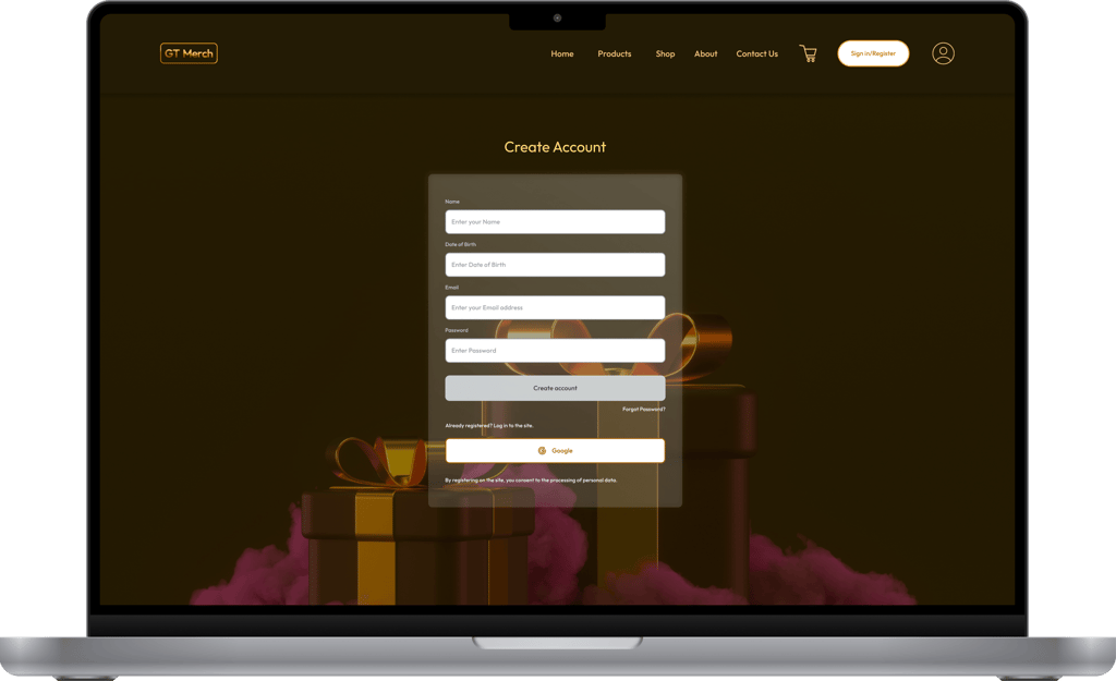
Created the login page that would be both functional and beautiful, conveying warmth and personalization of the GT Merch brand and also makes it easy for customers to access their accounts.
User Authentication


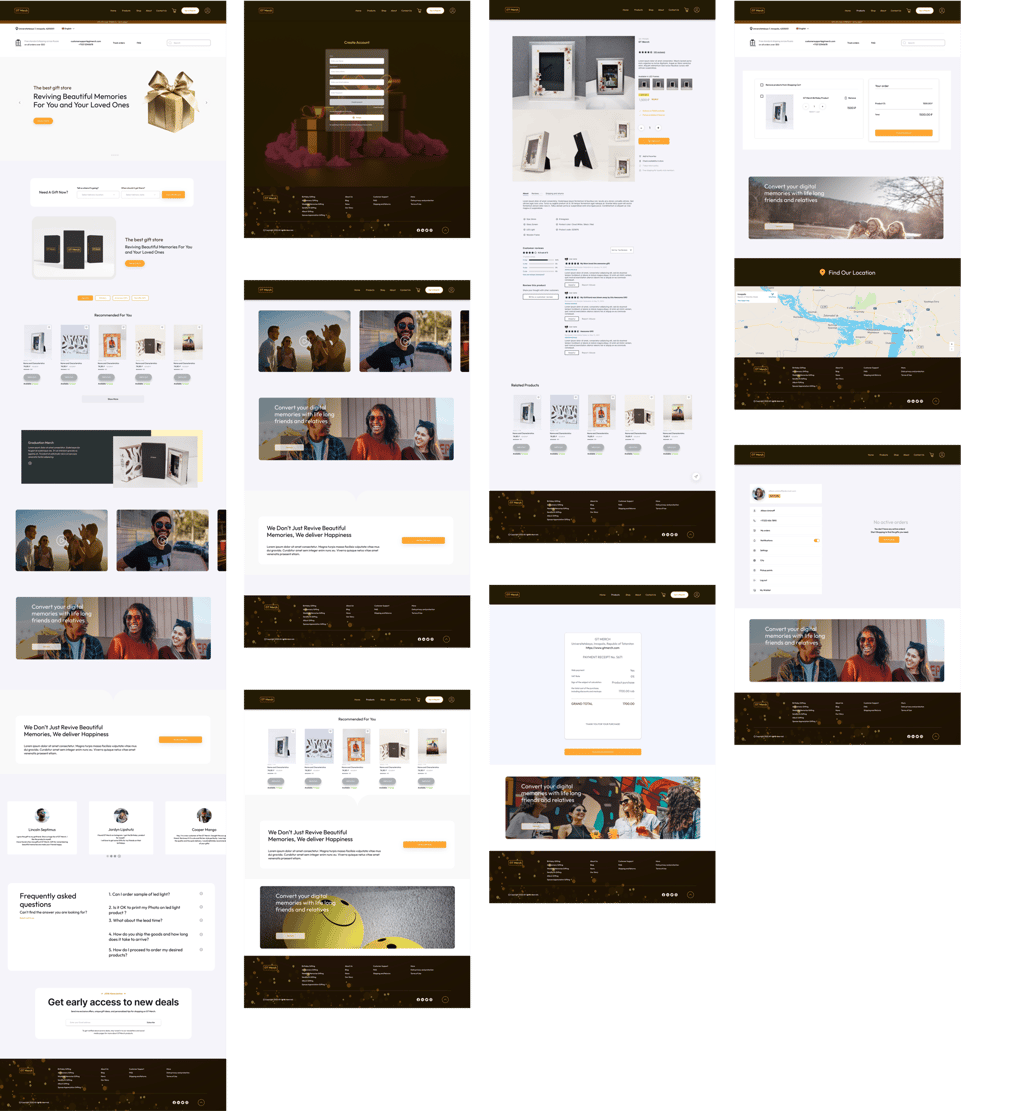
Visual Design

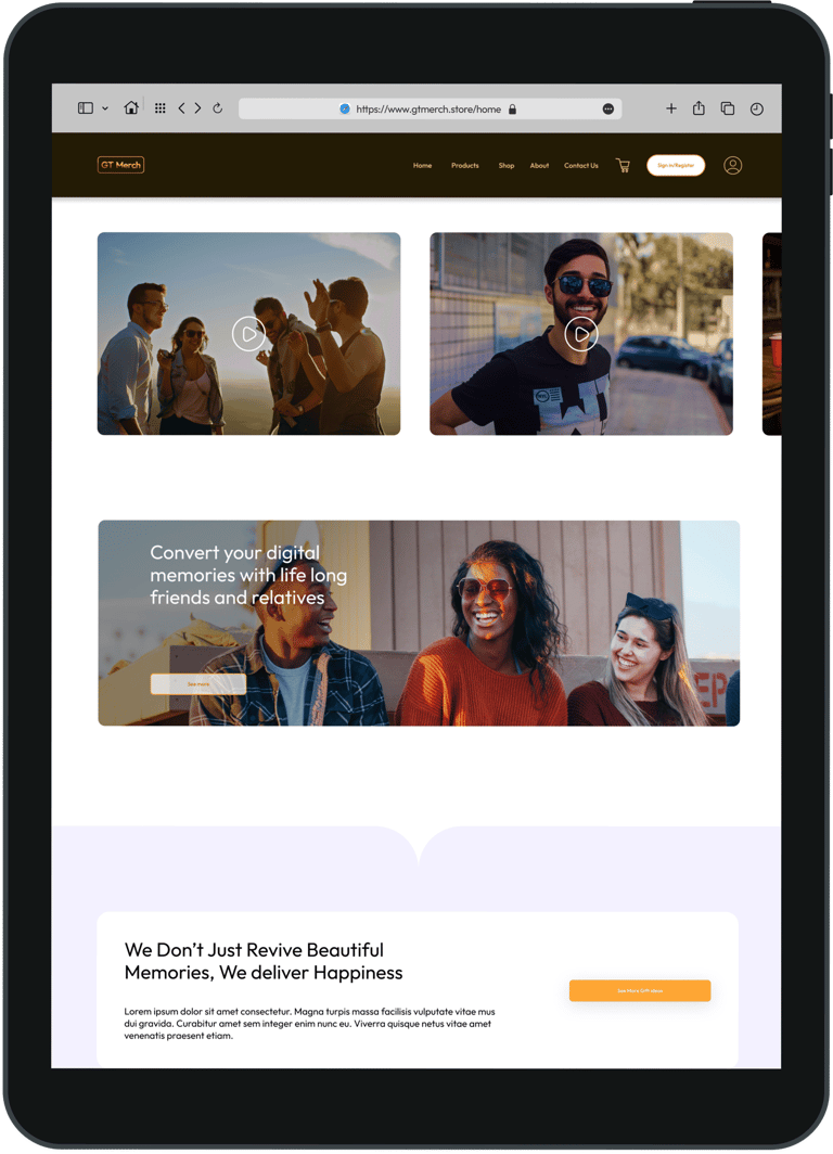
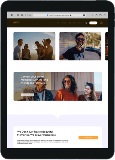
Focused on designing the tablet interface because they are a crucial part of the overall user experience. Created an interactive and immersive experience for users. Added swipe to browse gallery, which allows users browse through product categories by swiping left or right with their finger, making the website to feel dynamic.
Designing Interfaces

ANULIKA NWANKWO
Product Designer + IT Product Manager
hello@anulikajoy.com
MEDIUM /
📍North Holland, The Netherlands.